Third Eye Tarot Deck & Guidebook
ILLUSTRATIONS, PRINT LAYOUTS & BRAND IDENTITY
The Tarot is a deck of 78 cards. Each deck of cards hold the Major and Minor Arcana. The Major Arcana consists of 22 cards that tell the story of one’s life through spiritual lessons. The Minor Arcana consists of 56 cards that reflect the difficulties and challenges one faces on a daily basis. The Minor Arcana is organized into four suits; Cups, Swords, Wands, and Pentacles.
In November 2020, I had the idea to design a deck of tarot cards and guidebook as a passion project. I wanted to create a piece of design that combined my strengths in design and illustration. For this project I decided to design the 22 Major Arcana cards, including the illustrations, the layout and the typeface. I also decided to design a guidebook to accompany the deck for those who haven’t memorized the meaning of each individual card.
DESIGNED IN 2020
Illustrations
〰️
Print Layouts
〰️
Brand Identity
〰️
Illustrations 〰️ Print Layouts 〰️ Brand Identity 〰️
Third Eye Tarot
The strategy for the design of this deck of tarot cards and accompanying guidebook was to create something beautiful and informative. The design includes a logo, several illustrations, print layouts, and typography in off-white and faded black. This creates a minimalist design while still nodding to the vintage feeling of faded ink on old parchment.
The target audience for this tarot card deck and guidebook are individuals interested in religious, new age, psychic, and magical endeavours. This is not specific to a particular gender. This concept will also appeal to people who appreciate art and illustration.
This tarot card deck and guidebook features a modern and minimal design that will appeal to a more modern audience. Unlike classically designed and illustrated tarot cards, which tend to have intricate and colourful details, this minimally designed deck will appeal to the more modern tarot practitioners of the present day. At the same time, the illustrations are not be overly simplified and will still feature the necessary imagery that has classically been depicted in each card.
Inspiration
These images are some of the inspiration behind the design of this tarot card deck and guidebook. They all consist of simple and minimal designs, featuring two colours.
Sketches
My sketches for this concept are very simple. Each card will have a front and a back. The front of the card will feature the illustration and card title. The back will feature a consistent background that will be the same on every card. The guidebook will be the same size as the tarot cards. The front cover will feature a logo, the title and a short description of the book’s purpose. The inside layout will feature an illustration of the card on the left page and a description of the card’s meaning on the right page. Finally, the back cover of the guidebook will feature the same background illustrations as on the back of each tarot card.
Colour Palette
The design for the tarot card deck and the guidebook only features two colours. A cream colour is used to represent old parchment paper. A faded black colour is the only other colour used. It represents faded ink. This idea unifies the old origins of the tarot deck with a more modern execution of design and illustration.
Typeface
Sofia Pro is a simple sans serif font. It has been used in this design in order to remain consistent with the minimalist design. The main focus is meant to be the tarot card illustrations. Sofia Pro is a font that supports the design very successfully yet doesn’t draw away the user’s attention from the main focus of the design.
Logo
The logo for the Third Eye Tarot Card Deck and Guidebook is purposely designed to look hand drawn. The illustrative logo is meant to represent the same style of illustration present on each tarot card.
Illustrations
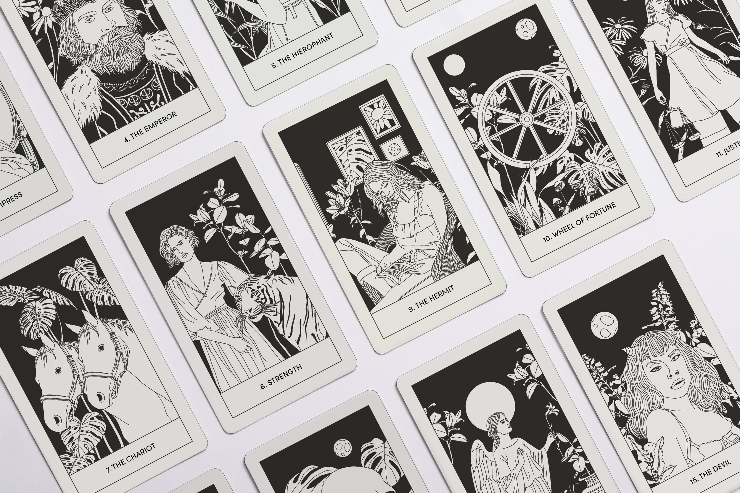
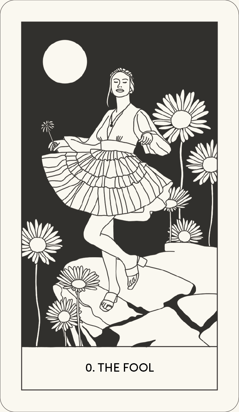
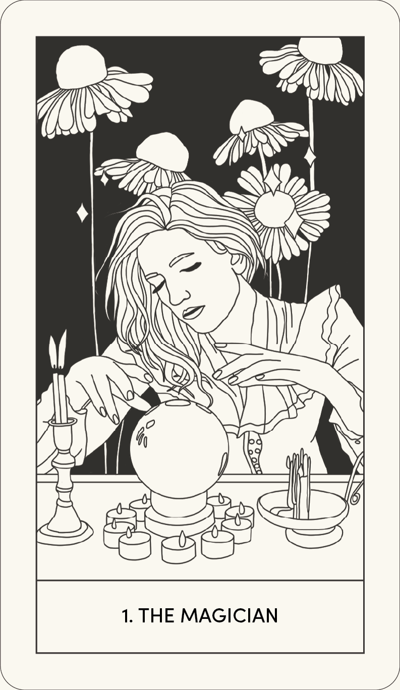
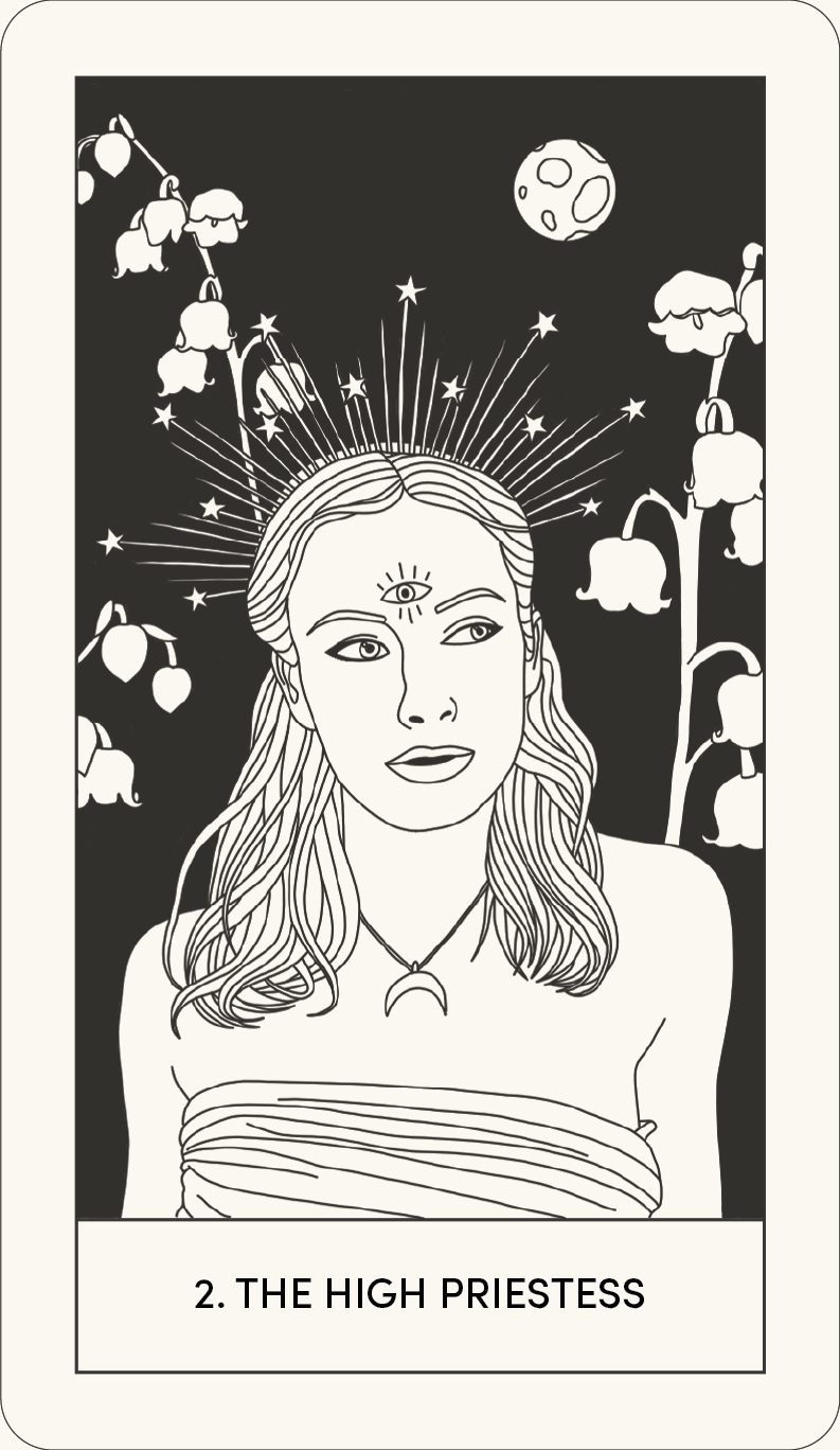
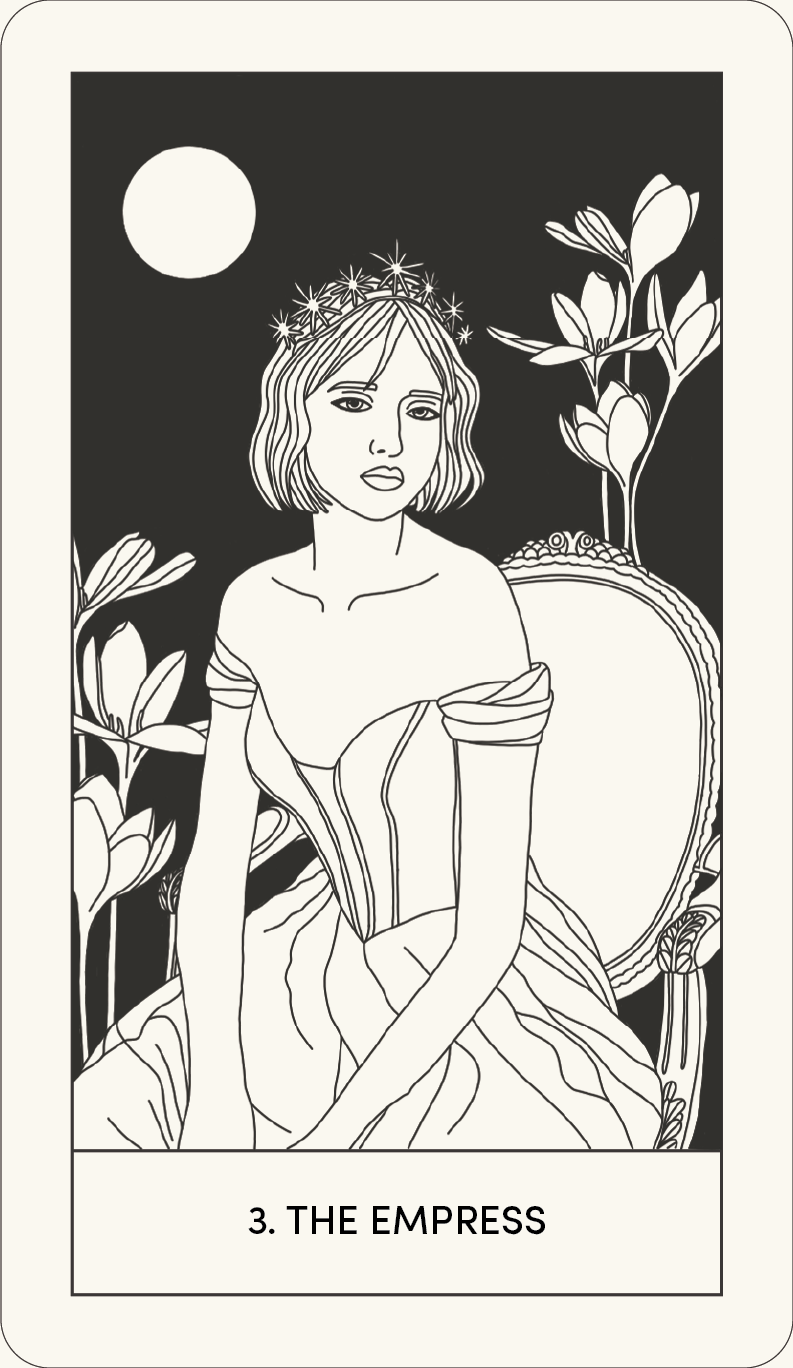
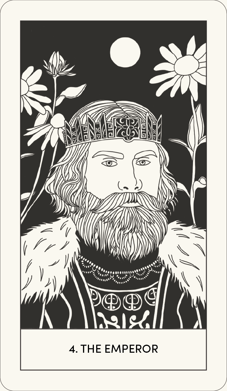
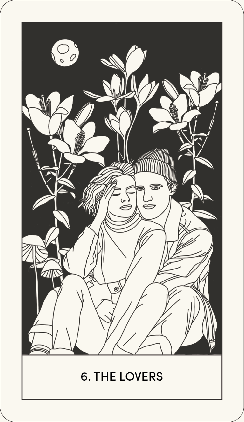
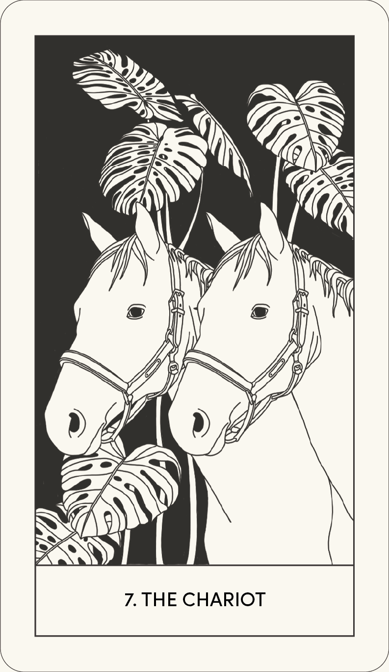
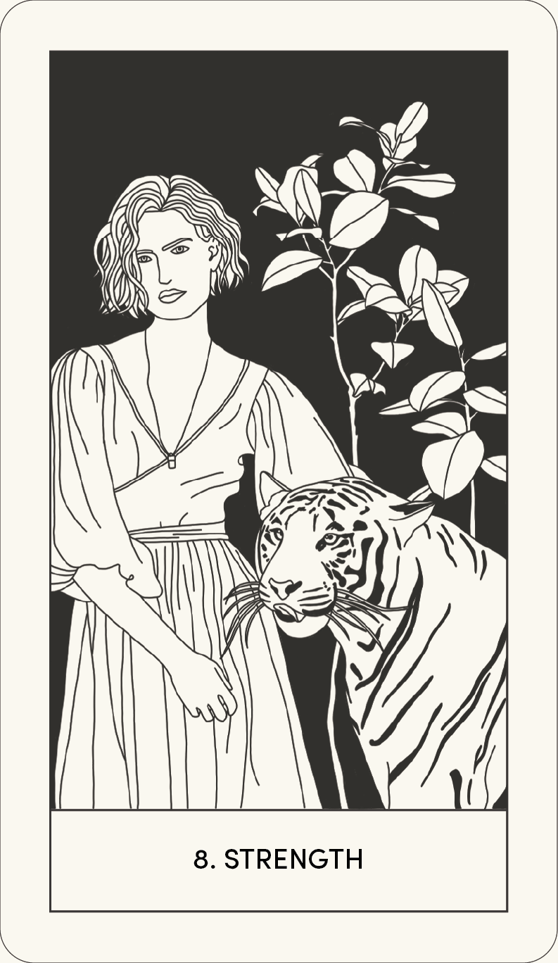
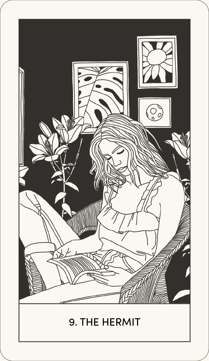
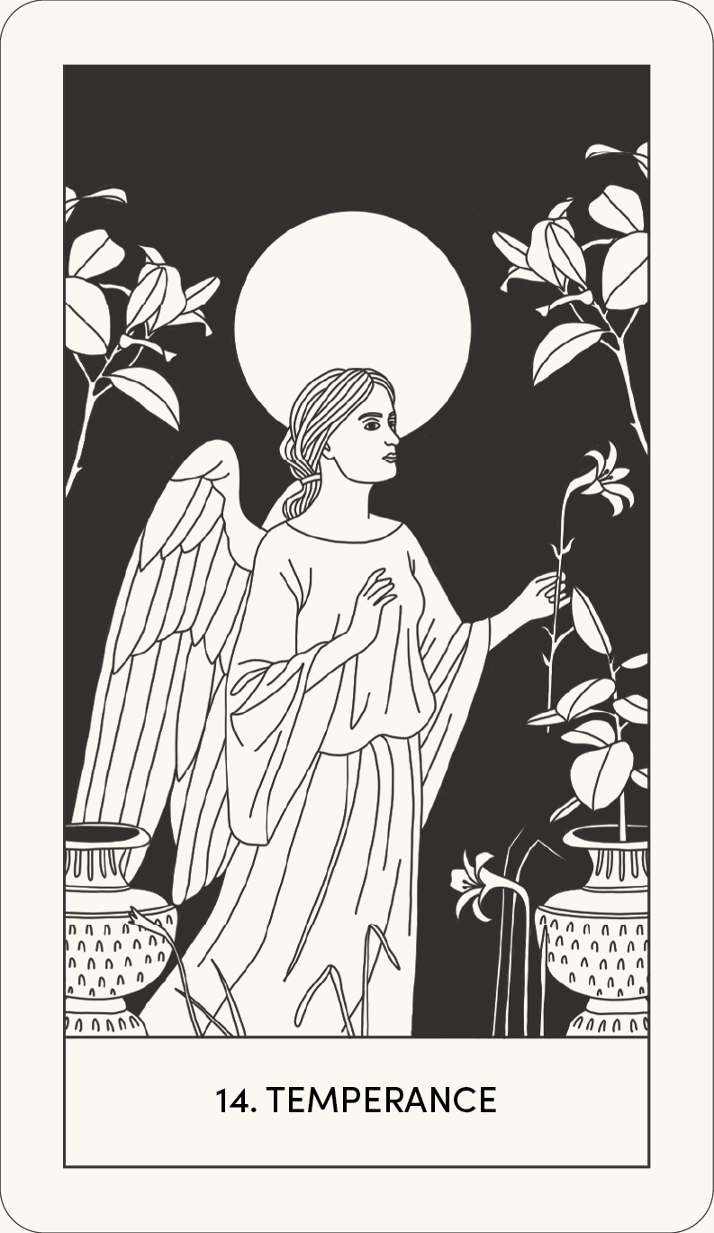
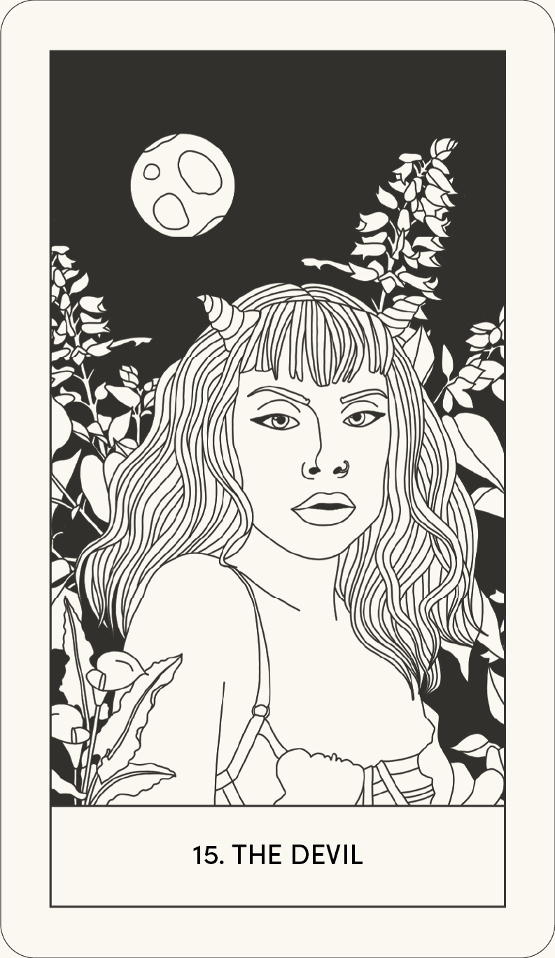
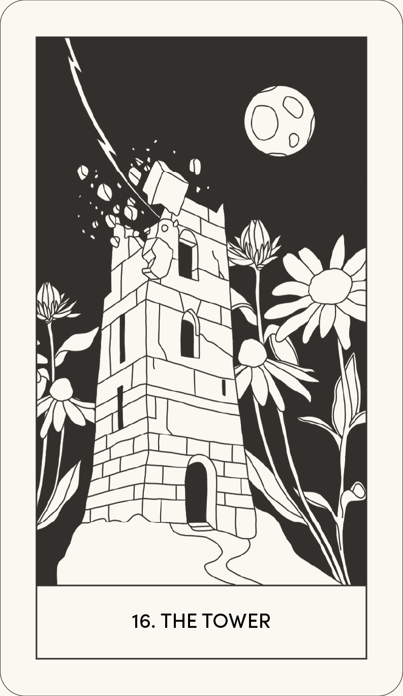
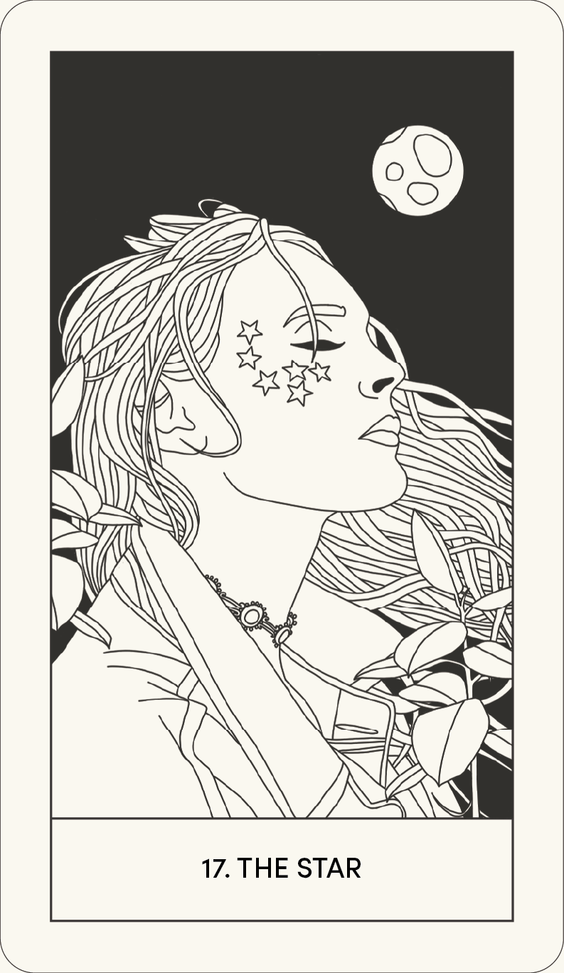
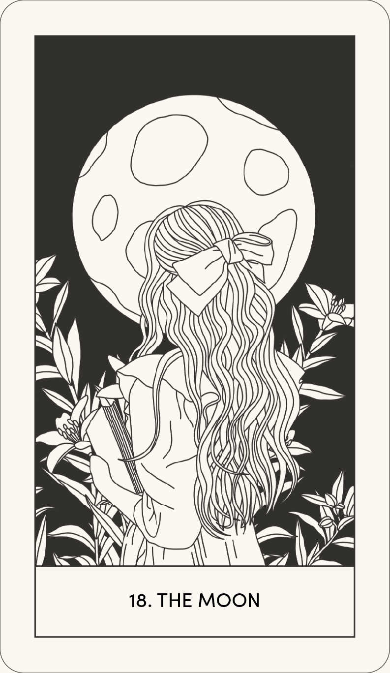
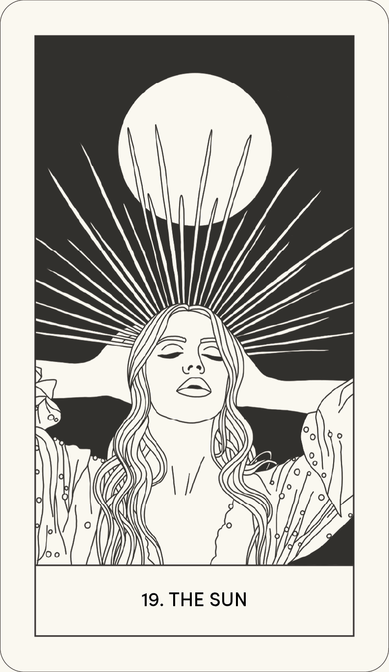
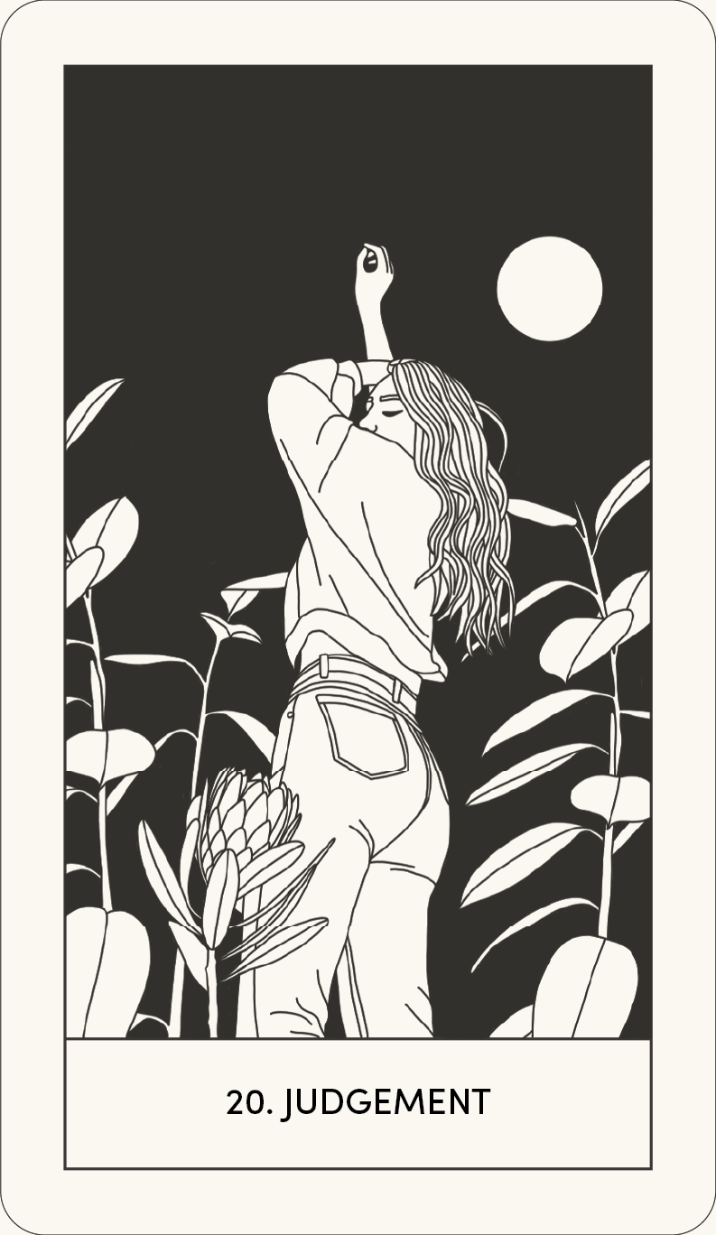
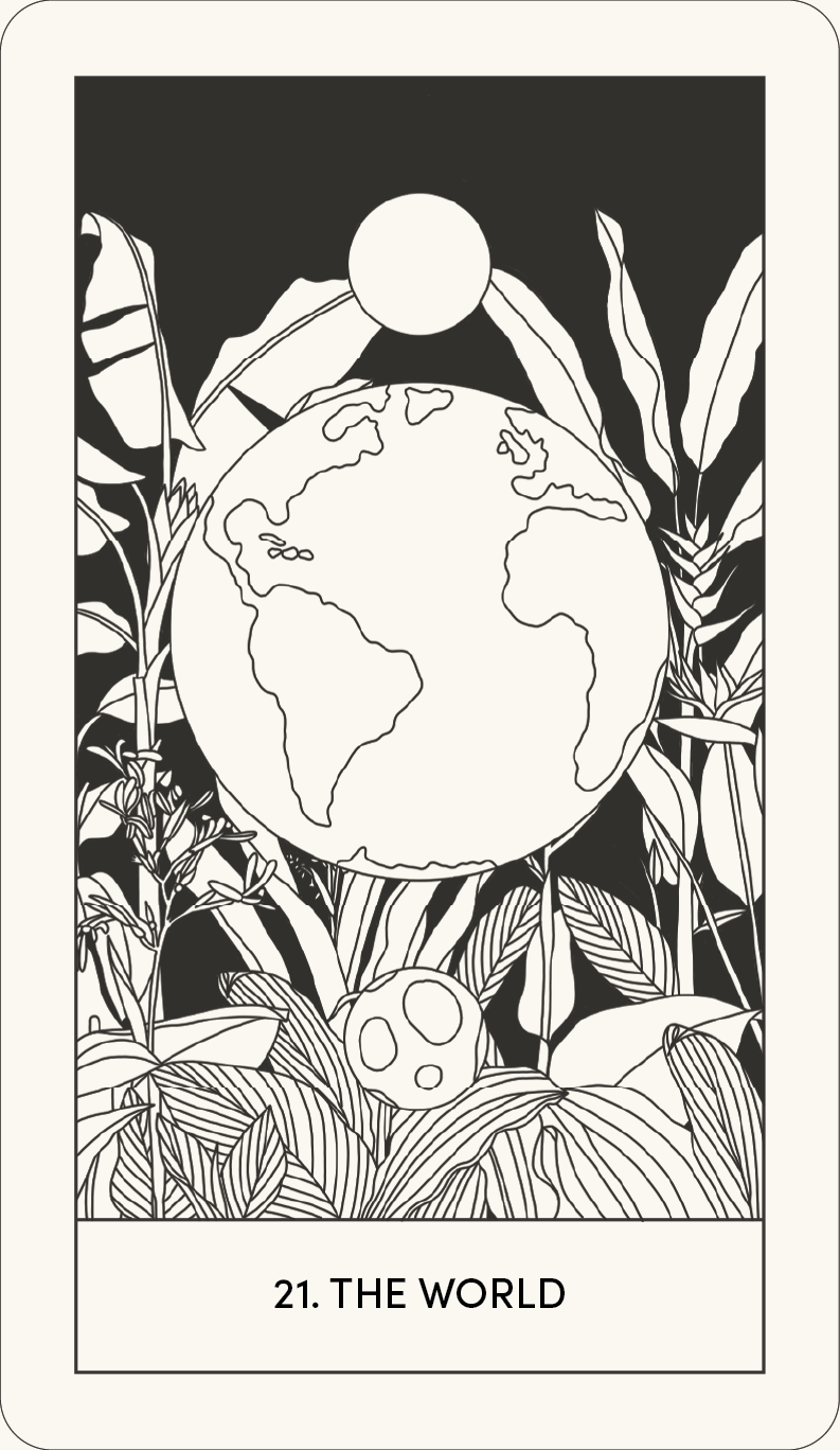
The design process start out with the creation of the tarot cards. Each tarot card represents a figure in the major arcana. The major arcana features 22 cards. First, I created a template for each tarot card. I then created the line artwork for the first card, adding more detail if needed. After finishing the line illustration, I filled in the background with the faded black colour. I repeated this process 22 times. After finishing the cards, I brought them into Adobe Illustrator to format them into the final cards. Each card has a width of 2.75 inches and a height of 4.75 inches.
The Tarot Cards
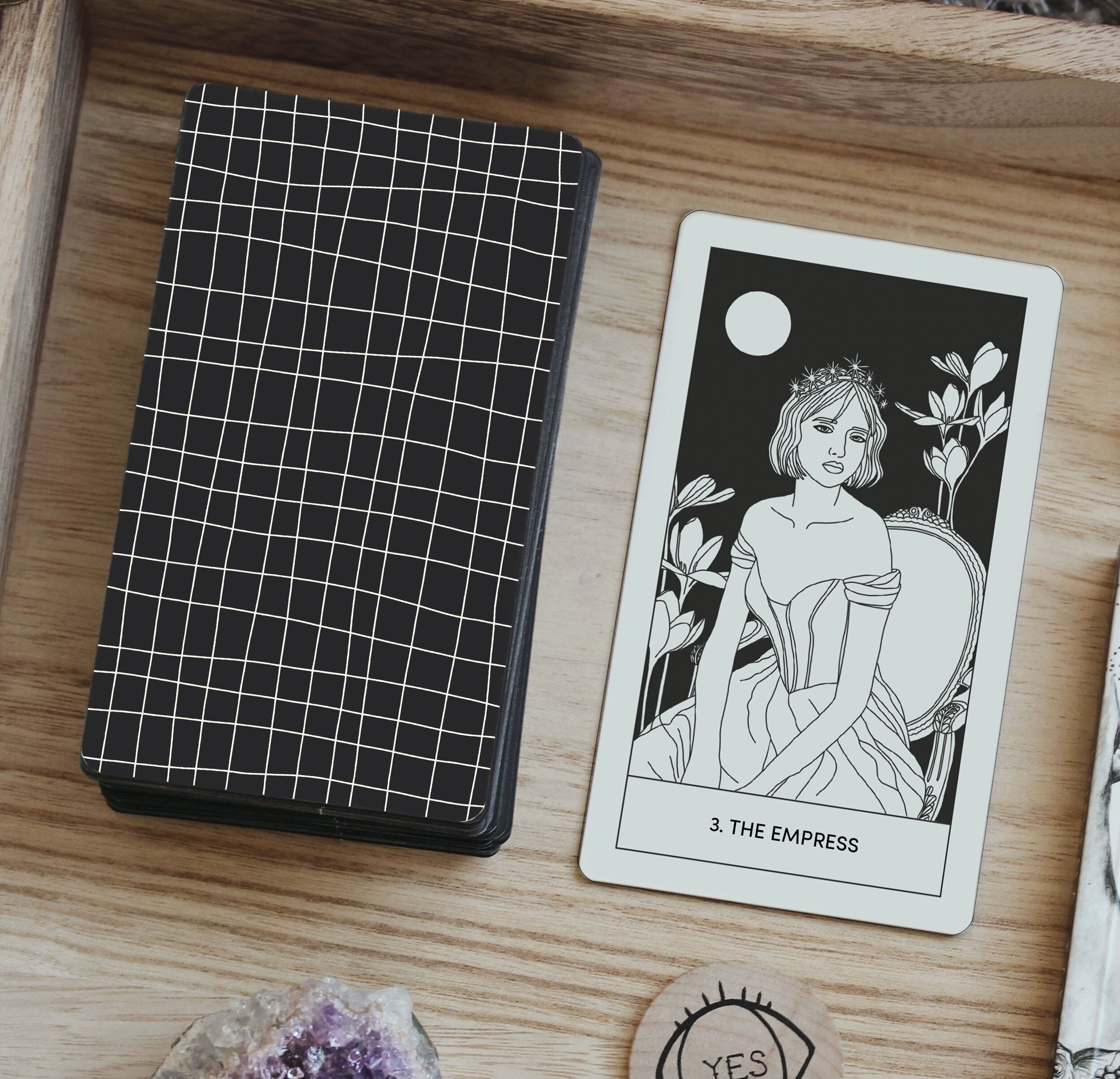
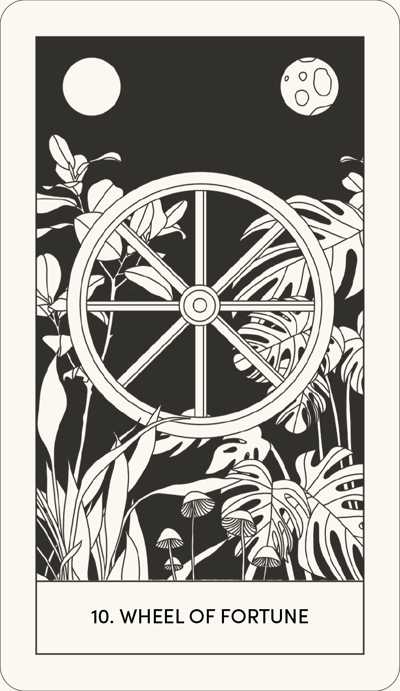
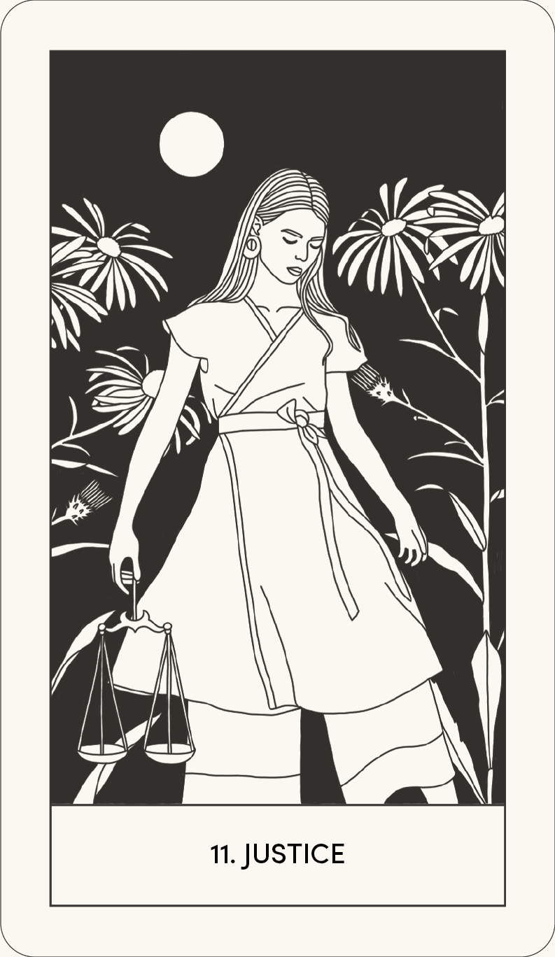
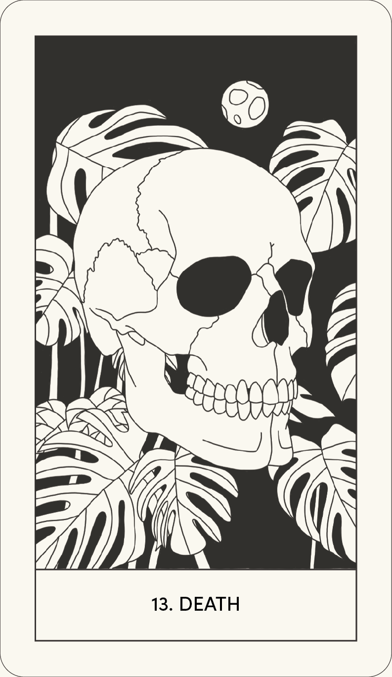
Each tarot card is designed to represent the original meaning of each card within the major arcana, but with a modern twist. As mentioned before, the colours are meant represent faded ink on old parchment paper. However, the layout, illustrations and typeface are based in a more modern style of minimal design. This unification of old and new is meant to appeal both to experienced tarot practitioners and individuals new to the practice.
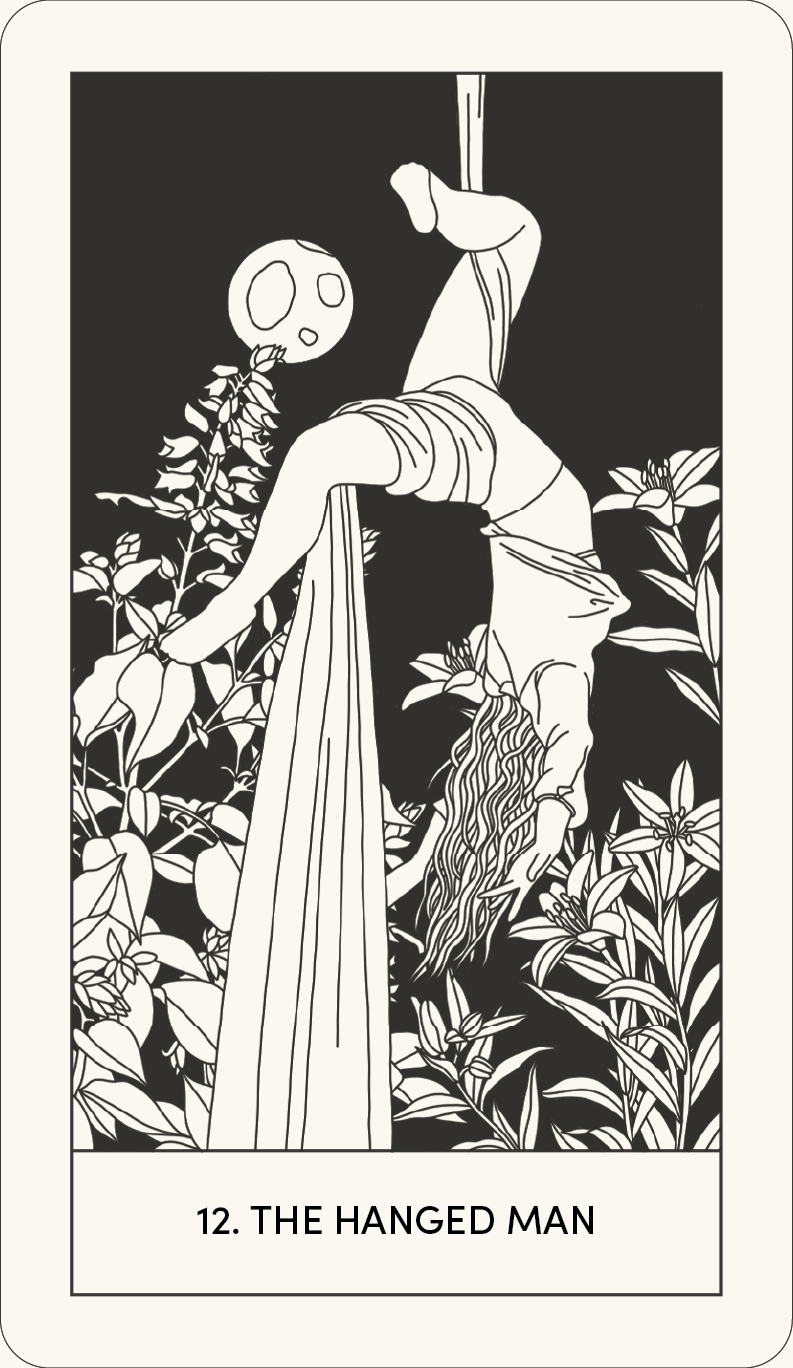
Each tarot card features a minimal style of line illustration. The illustrations range in detail, but each has enough detail to accurately represent the meaning behind each card. Some illustrations feature a more modern take on the meaning of the tarot card. For example, for a card that would feature a man in the original tarot deck, when the meaning behind the card doesn’t indicate one gender over the other, may feature a woman instead. For example, in the Third Eye Tarot Deck, The Hanged Man card features an illustration of a woman hanging from a silk curtain instead of the original imagery of a man hanging upside down from his ankle.
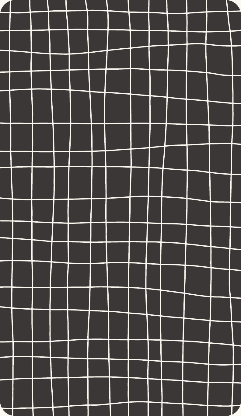
The layout of the card themselves are as minimal as possible in order to not draw too much attention away from the illustrations. The illustration in surrounded by a faded black line, with another line separating the illustration from the title of the card. The title uses the typeface Sofia Pro in a semibold line weight. The back of each card was a very simple and illustrative grid line design. The colours are reversed on the back of the card in order to provide some contrast between the two sides.

The Guidebook
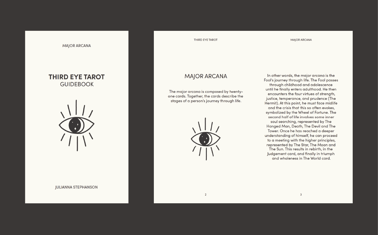
The Third Eye Tarot Guidebook is meant as an accompanying element of the design. It has the same dimensions as the tarot card deck, 2.75 inches by 4.75 inches, in order for the guidebook to fit nicely with the deck of cards. It would also make the packaging of the cards and guidebook more straightforward.
Beyond the dimensions, the guidebook’s layout is as minimalistic as possible. The front cover features the title and the Third Eye Tarot logo. Flipping open the book, the first two pages feature a simple description of the book’s contents and an explanation of the major arcana. The rest of the pages, other than the back cover, describe the imagery and definitions behind each tarot card. The left page of the spread featured a full page image of the relevant tarot card. The right page of the spread provides the description of the card. It features the card’s title and the meaning of the card when it’s upright compared to if it is drawn reversed. The descriptions are short and only feature the important themes of the card. The top of each page features the folios. The top of the left page features the title of the guidebook and the top of the right page reminds the reader that this tarot deck features only the major arcana. The bottoms of the pages feature the pages numbers.
Final Thoughts
Overall, this design is very successful. This project allowed me to combined my skills as both a designer and illustrator. The illustrations turned out the way I had intended, featuring a minimal and modern style of digital line illustration while still containing all the necessary details from the original tarot. The overall design of the tarot cards successfully bridges the gap between the old style of tarot with the innovative new take on the design. This is made possible by the parchment paper cream and faded black ink colours used throughout the design. Finally, the Third Eye Tarot Guidebook successfully supports the tarot card deck. Its minimal design remains consistent with the design of the layout of the cards and has the same dimensions as the cards in order to keep this ensemble portable.


