Beyond Yoga Studio Rebrand
BRAND IDENTITY & BRAND GUIDE
In January 2020, I was given a rebranding assignment for my graphic design program. I decided to reach out to a local yoga studio called Beyond Yoga Studio & Wellness Centre. Quickly, this assignment became a real passion project for me. I was able to combine my knowledge from my recently attained yoga teacher certification with my knowledge of design.
Beyond Yoga Studio and Wellness Centre is located in Ottawa, ON. The centre opened in January 2015. The name Beyond was chosen because the owner, Tina Ferrone’s dream was to create a sanctuary that would enable individuals to “reach beyond” to rediscover themselves in search for their true purpose and passion.
DESIGNED IN 2020

Brand Identity
〰️
Brand Guide
〰️
Brand Identity 〰️ Brand Guide 〰️
Beyond Yoga Studio & Wellness Centre
The goal of this studio’s rebranding is to appeal to a larger range of potential customers. The target audience for this yoga studio is largely women 45+ years. The new brand identity will attract the desired target audience of individuals between the ages of 16 to 45 years old. With this in mind, I wanted to create a logo that is bold and modern. Compared to the previous design, the new design is more centred around the logo artwork instead of a wordmark. The new brand design showcases a refreshed and appealing brand identity.
Previous Design
The previous design for Beyond Yoga Studio & Wellness Centre features a simple flower graphic, representing the letter “Y”, within a larger word mark. The logo features a navy blue, a vibrant teal, and a bright yellow.
Inspiration
My vision was to create a design that centres around the human form, specifically the female form because women form the majority of the customer base. I avoided incorporating imagery relating to commonly used yoga symbols like the lotus flower. A female form in a yoga pose would very clearly represent the business, but is a more unique type of logo artwork in the yoga industry.
Sketches
I experimented with various yoga postures and other imagery like the sun and the moon.
Colour Palette
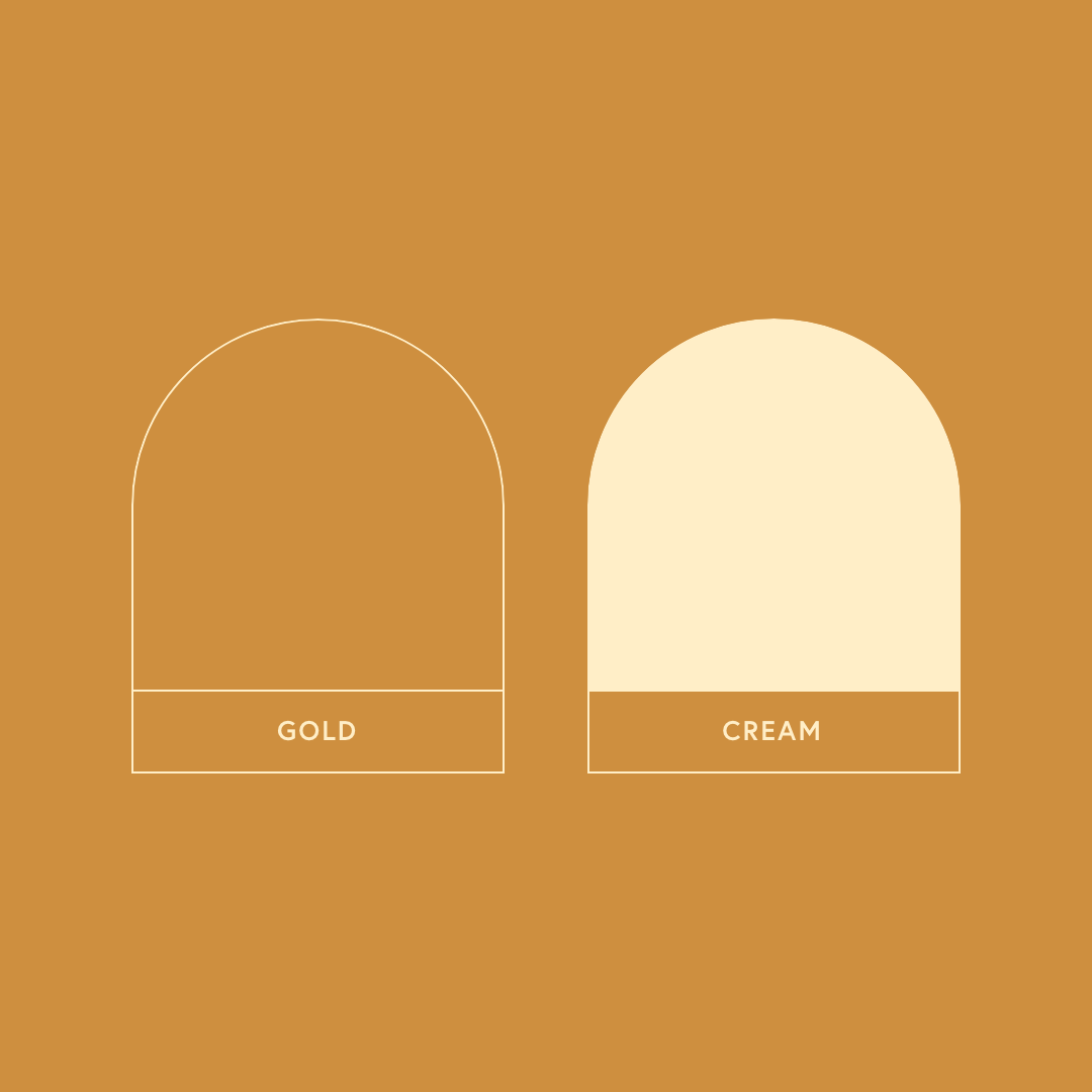
The colours featured in this logo artwork are gold and cream. The gold colour symbolizes the golden colour of sunlight. This furthers the connection the logo artwork has with the sun and what the sun represents. The cream colour provides a soft colour contrast with the gold.
Typeface
The typface featured in the logo design is Sofia Pro. This sans-serif font provides some harmony to the minimal and simplistic logo design. This ensures that the overall logo design is sleek and simple. Sofia Pro is a minimal sans-serif font family. It has a large variety of weights and italics. There is also a condensed verison of the font. It is highly readable as both a print and web typeface, at various sizes and weights. In this logo design, Sofia Pro Bold is used for the main heading and Sofia Pro (Regular) is used for the subheading.
Logo Iterations
I created many iterations of the two main logo design visions. One with the balanced symbolism between the sun and moon, while the other with a simple emphasis on the symbolism of the sun. The first of these logos was selected for its simple artwork and defined hierarchy in the wordmark.
Logo
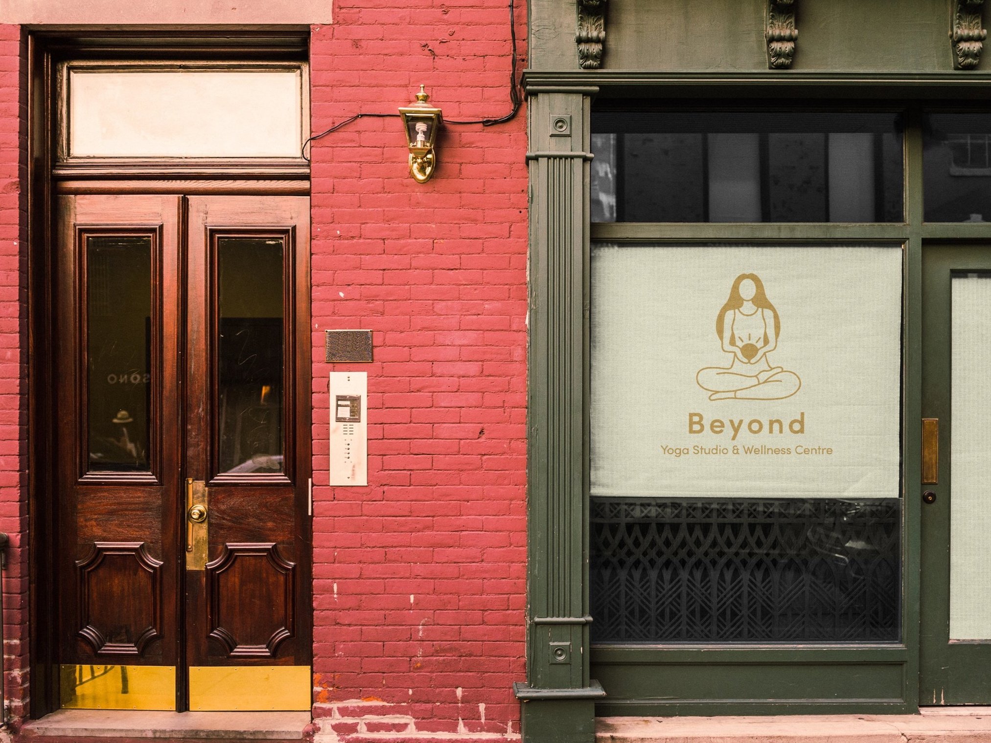
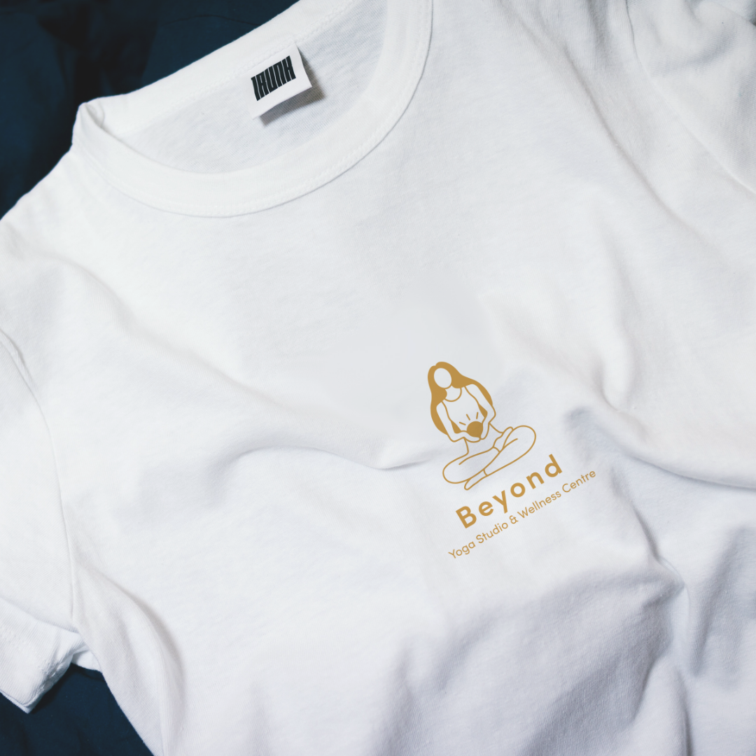
While designing the new logo for the yoga studio, I wanted to make sure to create a logo that stands out from the other yoga studios nearby. The idea behind this logo artwork is based on yoga philosophy. The logo design features a female form sitting in a pose of ease and meditation. She is holding a sun in her hands at her navel. In yoga, there is a term called tapas. This means self-discipline, inner fire and passion. The sun represents the tapas, or inner fire, it takes to attend a yoga class. It is located at the navel because this is also the location of the solar plexus chakra. It also important to mention that the woman is sitting in a meditative pose because this was the original yoga posture. The millions of postures came later on, with the intention of making this seated pose as easeful as possible.
Brand Guide
The branding guide has a height of 8.5 inches and a width of 11 inches. The width of a full spread is 22 inches. The layout is designed to be as minimal as possible in order to showcase the important content without any distractions. The design features the main two gold and cream colours featured in the brand design and the typefaces used are also unified with the brand design, Sofia Pro and Sofia Pro Condensed.
Final Thoughts
Branding and creating a branding guide for this yoga studio was a really fun and informative project for me. It combines some of my favourite types of designs, brand identity and print. Beyond that, I was also able to combine my design passion with my yoga teaching passion in order to create the logo artwork. This project is one of my favourites I’ve worked on.


