Marces Wellness Brand Identity
BRAND IDENTITY & BRAND GUIDE
Marces Wellness provides holistic nutrition consultations, helping clients improve their health with diet and lifestyle changes with life coaching and overall support. In the long-term the brand would like to grow and open a clinic with other practitioners offering services like massage, yoga, personal and training.
As a new business venture, the client’s objective was to have us design the foundation of the Marces Wellness brand identity. I was lucky enough to work on this project through my position as graphic designer at Grant Burke Design Inc. My creative directer, Grant Burke, provided me with valuable feedback throughout the design process.
DESIGNED 2022

Brand Identity
〰️
Brand Guide
〰️
Brand Identity 〰️ Brand Guide 〰️
Marces Wellness
Marces Wellness is simply about functional and whole body health. It is about empowering people to change their lives for the better while providing a process that makes things as straightforward as possible. After initiating the journey of transformation, this process will only be successful if the steps are maintainable in the long-term.
Although everyone can access the services offered by Marces Wellness, that target audience are women, ages 20-50. This is the audience that will relate most to the client and her services. Adult women are also more likely to recommend the services to their family members and friends.
Colour Palette
The Marces Wellness colour palette is earthy and soft. The primary brand colours are our signature Lavender purple, Parchment white and Stone grey/green. The accent brand colours are Earth green and Sea Foam blue.
Typefaces
New Spirit is the primary typeface family for Marces Wellness and is used for primary headings and subheadings. It has a natural and organic feeling to it, making it perfect for a holistic wellness brand. Montserrat is the secondary typeface family for Marces Wellness and is used for section headings, secondary subheadings and body copy. It is a easily readable, geometric, sans serif font that pairs perfectly with New Spirit.
Logo
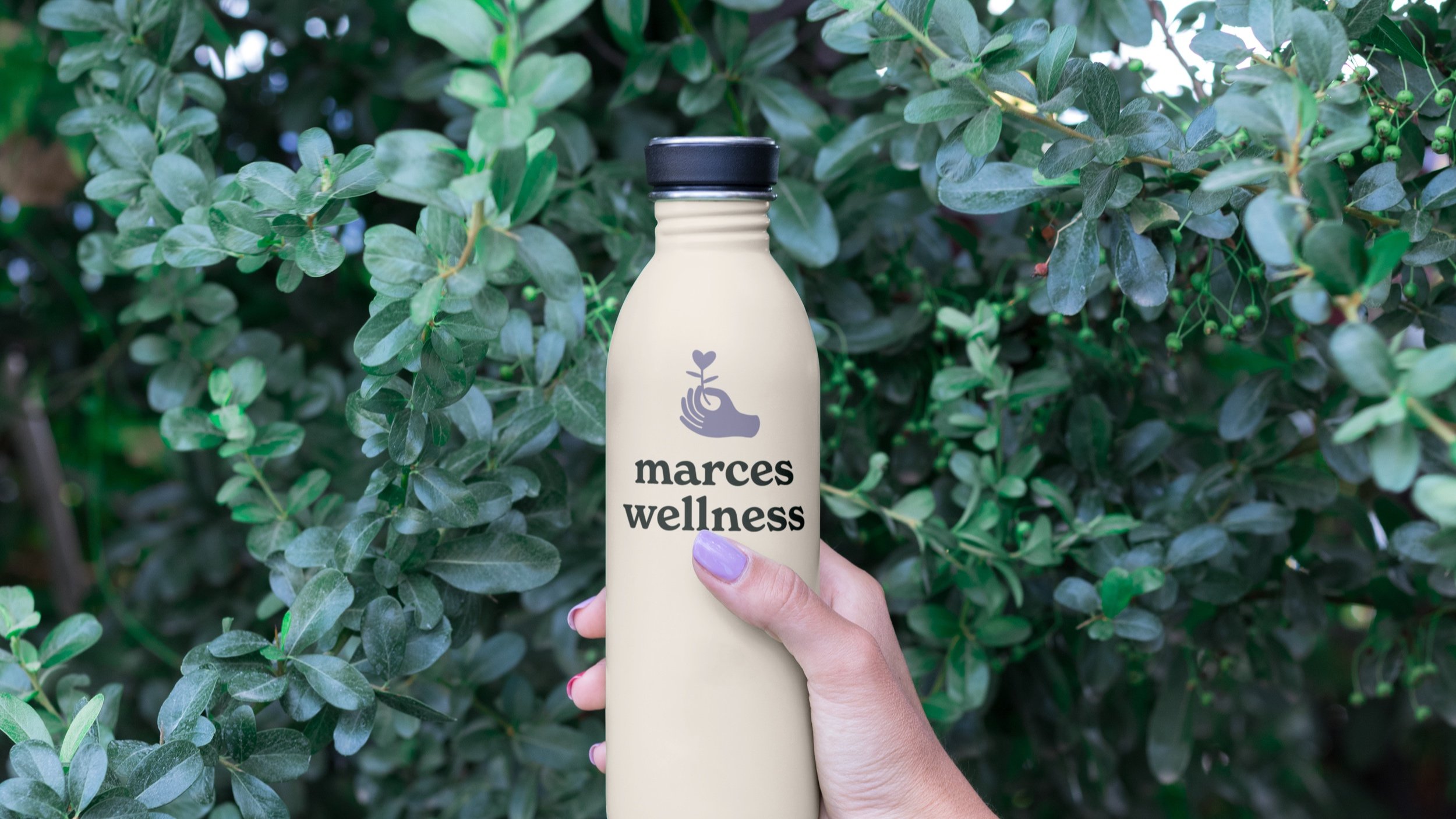
The logo icon for Marces Wellness is a hand-drawn hand holding and heart-shaped flower. Since the brand has several different services, we aimed to keep the icon from being too specific. The heart flower represents holistic wellness. The hand represents Marces Wellness offering these services.
Flower Illustrations
The minimal flower illustrations are used to incorporate a natural, playful feeling to any piece. When used sparingly, these illustrations create eye-catching accents that support the earthiness of the brand.
Brand Guide
Marces Wellness has a visual identity that represents its core values, people, and culture. The aim is for a consistent and high quality representation of the brand across all platforms. This guide helps the client and designers to effectively produce Marces Wellness materials that are both on-brand and visually appealing. In some cases precise rules are specified that need to be followed, but overall this guide is meant to establish useful parameters without restricting creativity.


