Luna App Prototype
LOGO, UI DESIGN & APP PROTOTYPE
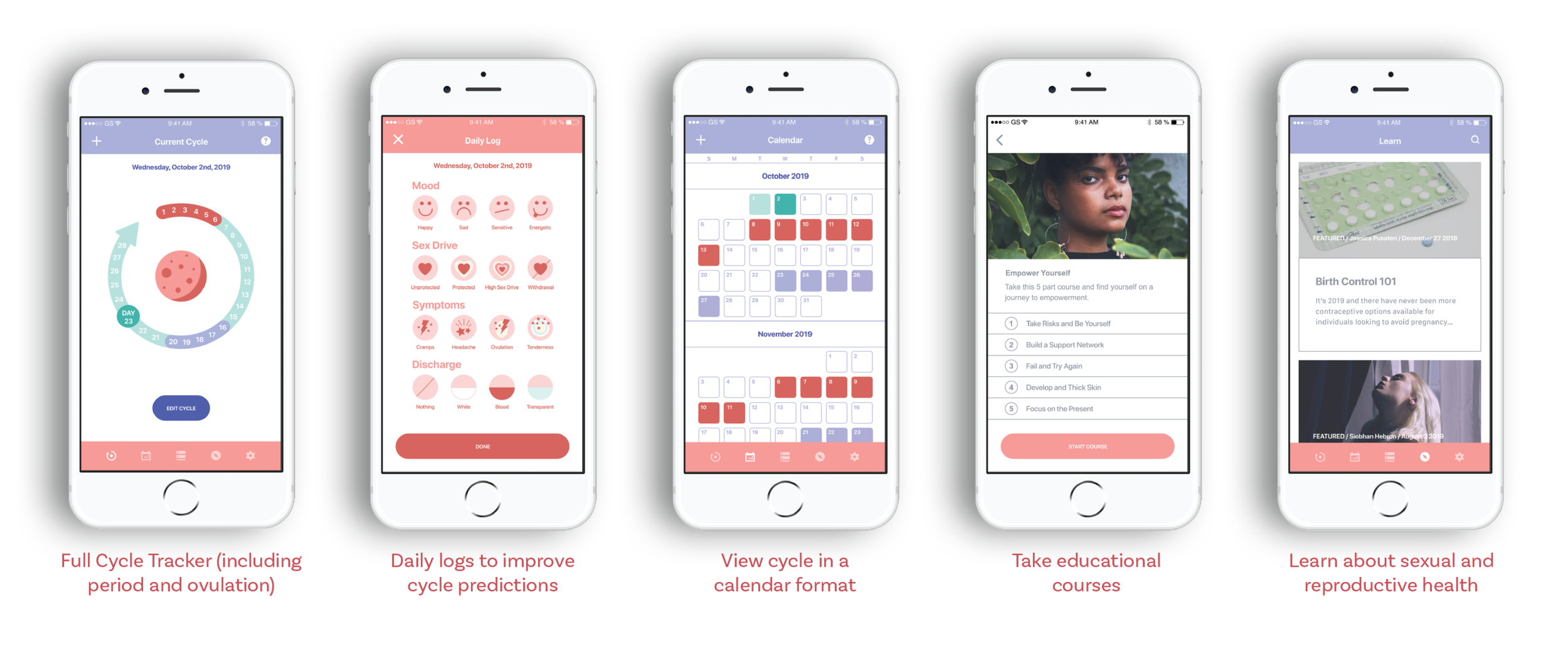
As a passion project, I decided to redesign an app prototype I designed as an assignment for my graphic design program. The concept I created for the app was really interesting to me, therefore I decided that I wanted to hold onto the concept while redesigning the rest of the prototype.
Luna is a period and ovulation tracker app for anyone with a cycle. Luna is a scientifically-backed app that predicts an individual’s menstrual and reproductive cycle. This app provides individuals with the ability to take control of their sexual and reproductive health by tracking their cycle, taking educational courses and reading informative articles.
DESIGNED IN 2020
Logo
〰️
UI Design
〰️
App Prototype
〰️
Logo 〰️ UI Design 〰️ App Prototype 〰️
Luna | Period and Ovulation Tracker
The strategy for the Luna App is to create an accessible source of information and education regarding sexual and reproductive health for people who menstruate. The objective is to design the app in a way that is visually appealing while also providing courses and articles for the users that are looking for information about their sexual and reproduction health and wellbeing. This is important because about half the world's population experiences menstruation and ovulation, but they often lack a detailed sexual and reproductive education.
The primary audience for the Luna App are people who menstruate and ovulate. This audience is primarily women and girls between 13-50 years old. This app is targeting such a wide audience because reproductive care has so many different aspects to it; from family planning, to tracking the menstrual cycle, to an overall reproductive health education. More specifically, the app is targeting people who need help with their fertility, people who want to track their general reproductive health, or people who want a better understanding of the body and its inner workings.
Previous Design
When I first created this app concept, in my second year of my graphic design program, I loved the idea. The original design I created just didn’t turn out as I expected it to in my mind. Looking back now, the original design just doesn’t feel finished. The design feels flat and could use quite a few adjustments.
My intent for the redesign of this app prototype was to basically start from scratch. I wanted to change the colour palette, change the typefaces as well as to adjust the logo artwork and word mark. I also wanted the new design to be more accessible.
Inspiration
I wanted to create a minimal design that is both approachable and professional. A design that will appeal to the large target audience of anybody who menstruates.
Sketches
The new layout sketches show the new direction of the app. The app will look more minimal while also being less flat.
Colour Palette
Reds and pinks are utilized in the design in order to represent menstruation. The purple colours are used in order to add some contrast and represent the lunar aspect of the design.
Typefaces
The new design features the typefaces Playfair Display for headings and FranklinGothic URW for body copy. These typefaces look more sophisticated while still fairly minimal. Using Playfair Display for the headings adds more interest to the design compared to the single sans serf font featured in the previous design.
Logo
The Luna app is designed around the symbolism of the moon and its influence on the menstrual cycle. The brand’s logo is a moon. This moon logo is also the featured artwork on the app’s homepage, the cycle tracker.
App Icon
The Luna app icon is a very simple design. The Luna app logo is placed on a light pink/cream background.
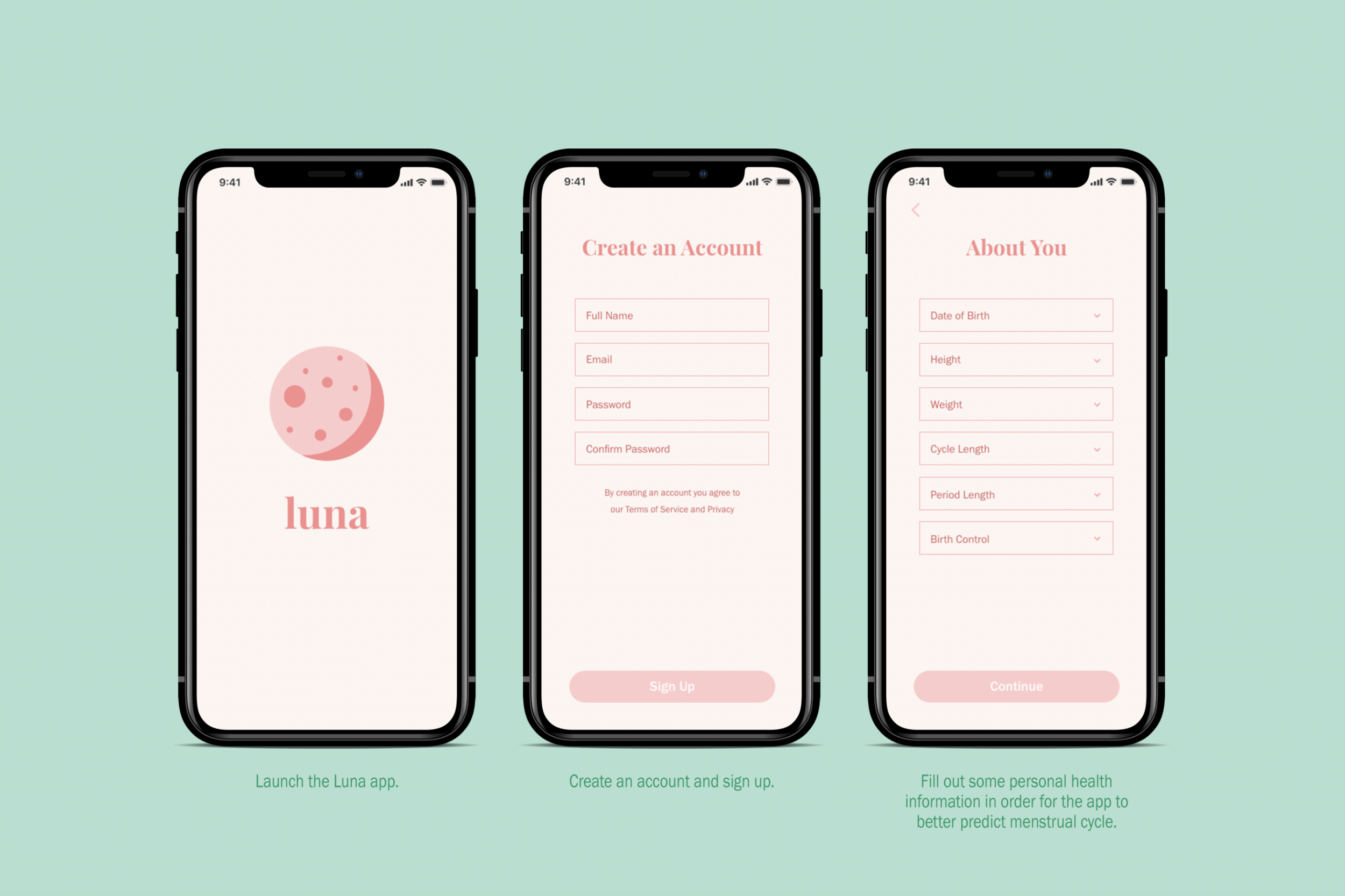
Welcome
Health Profile Quiz
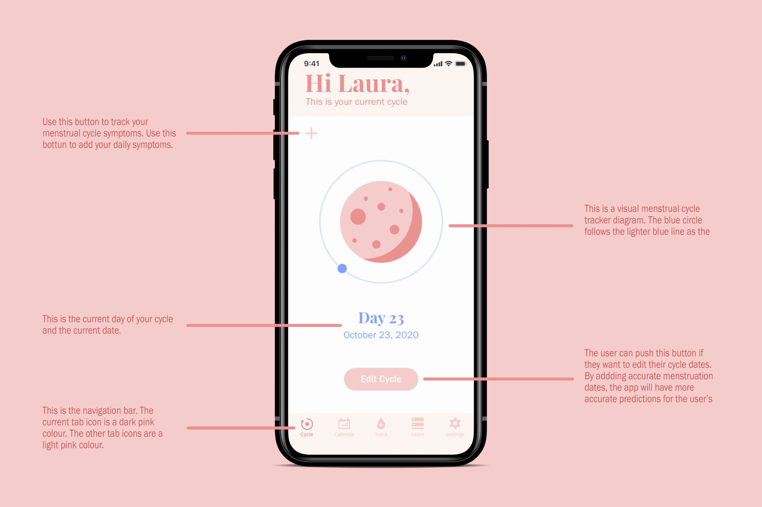
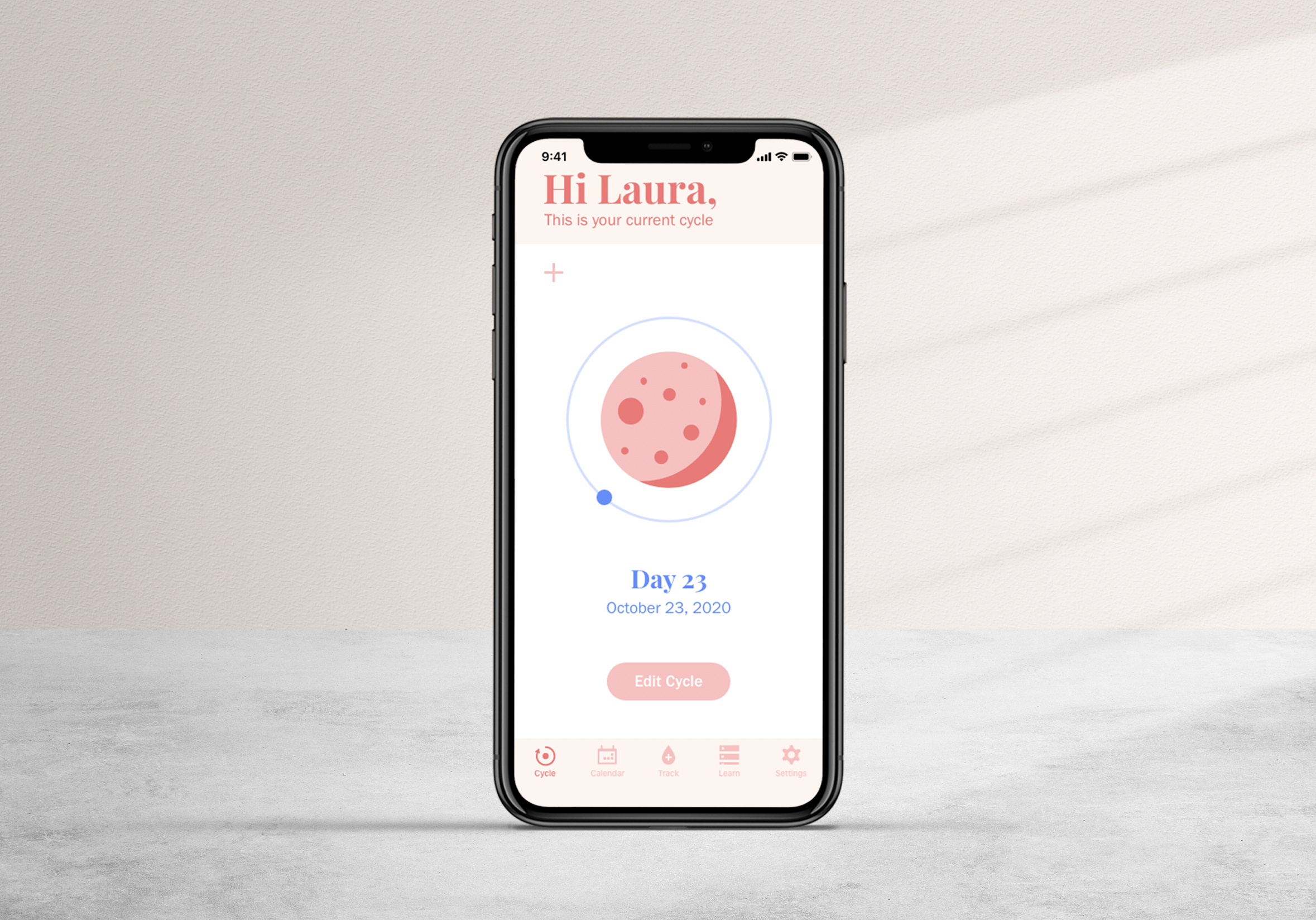
Cycle Tracker
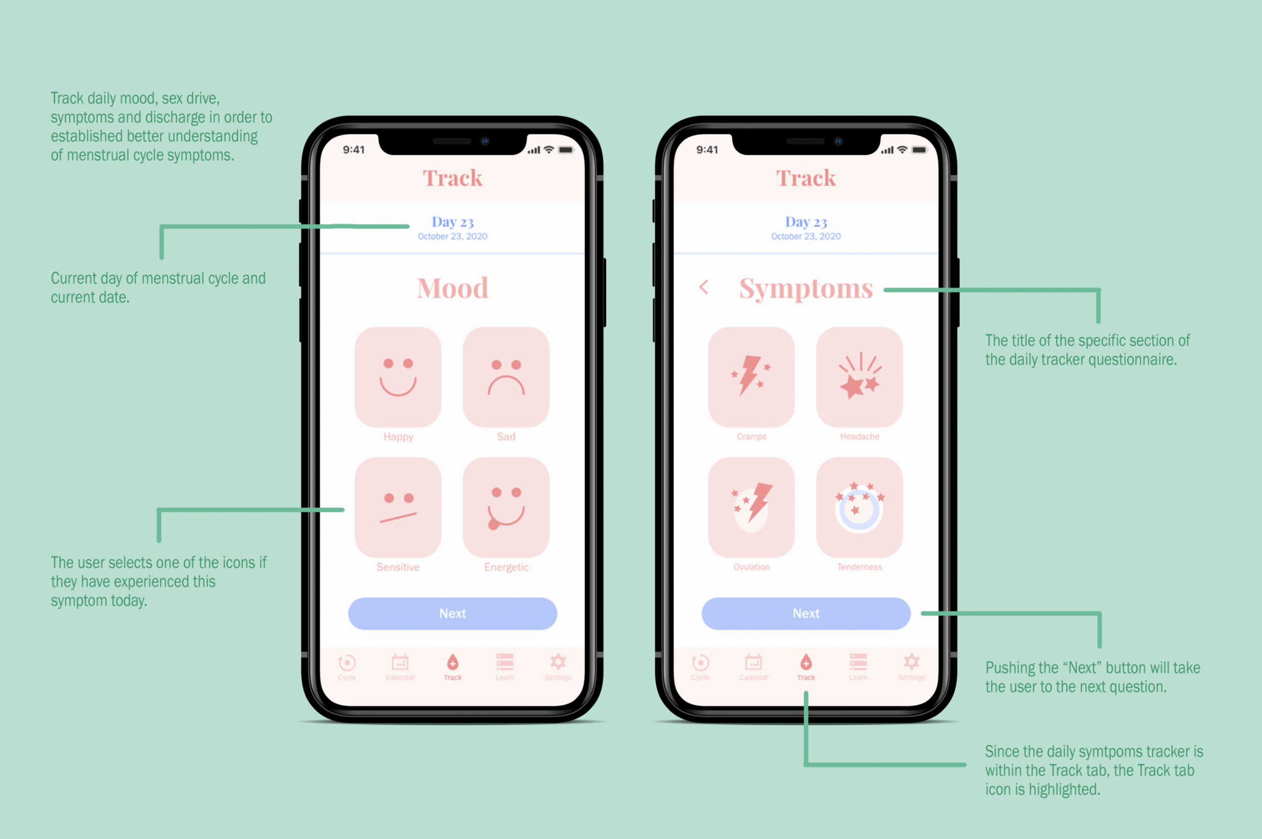
Track Symptoms
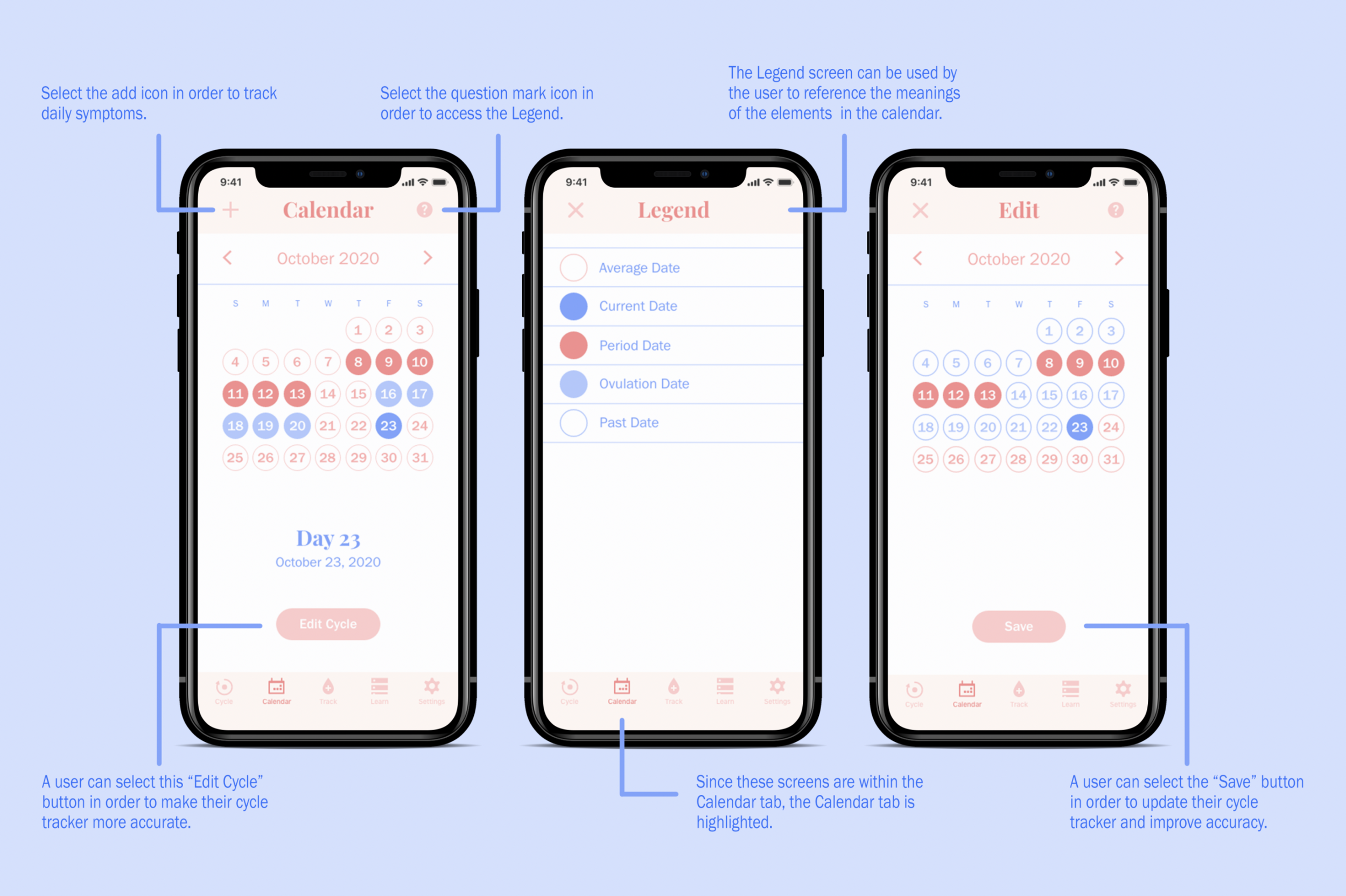
Calendar
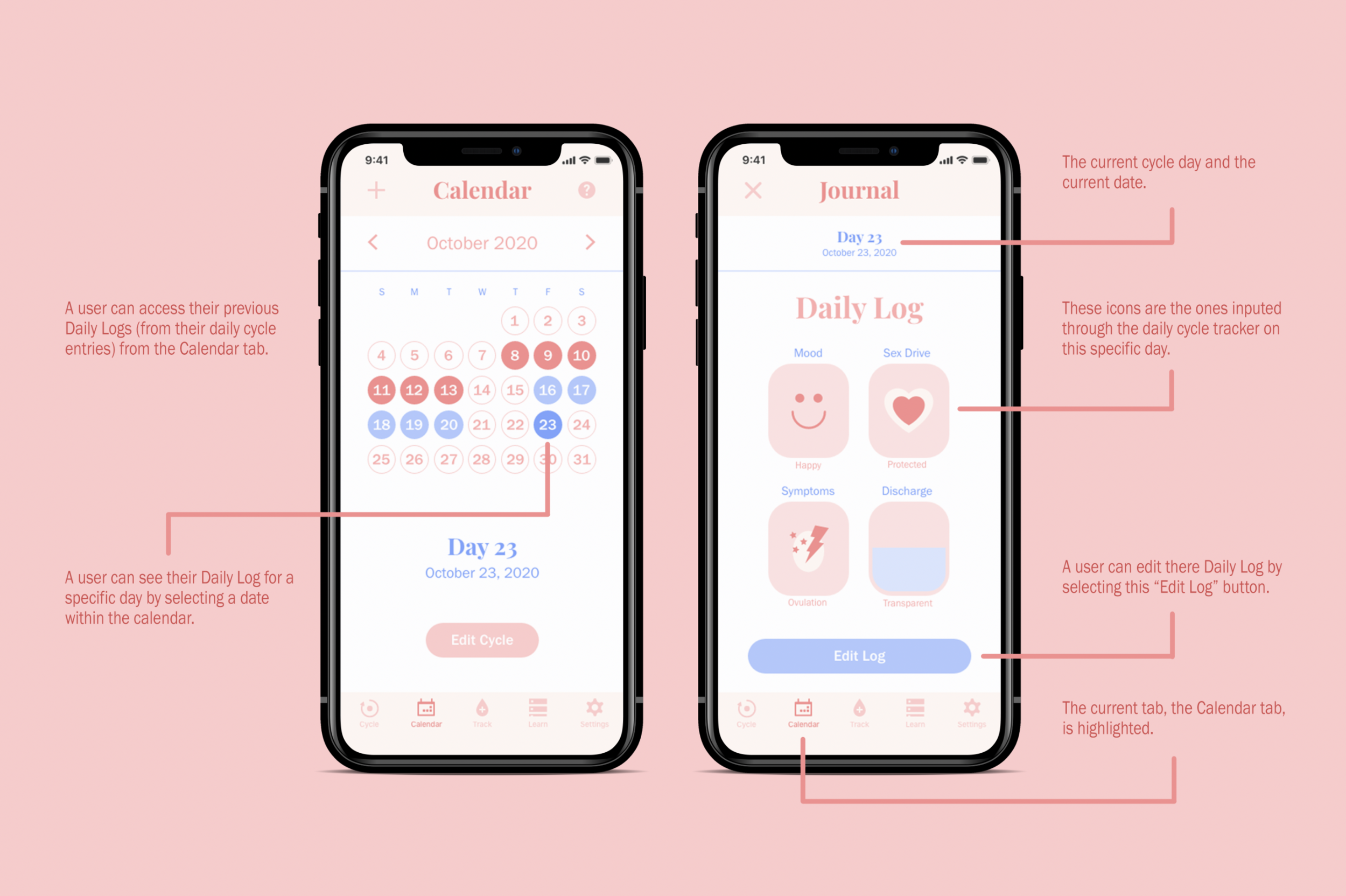
Daily Log & Journal
Educational Courses
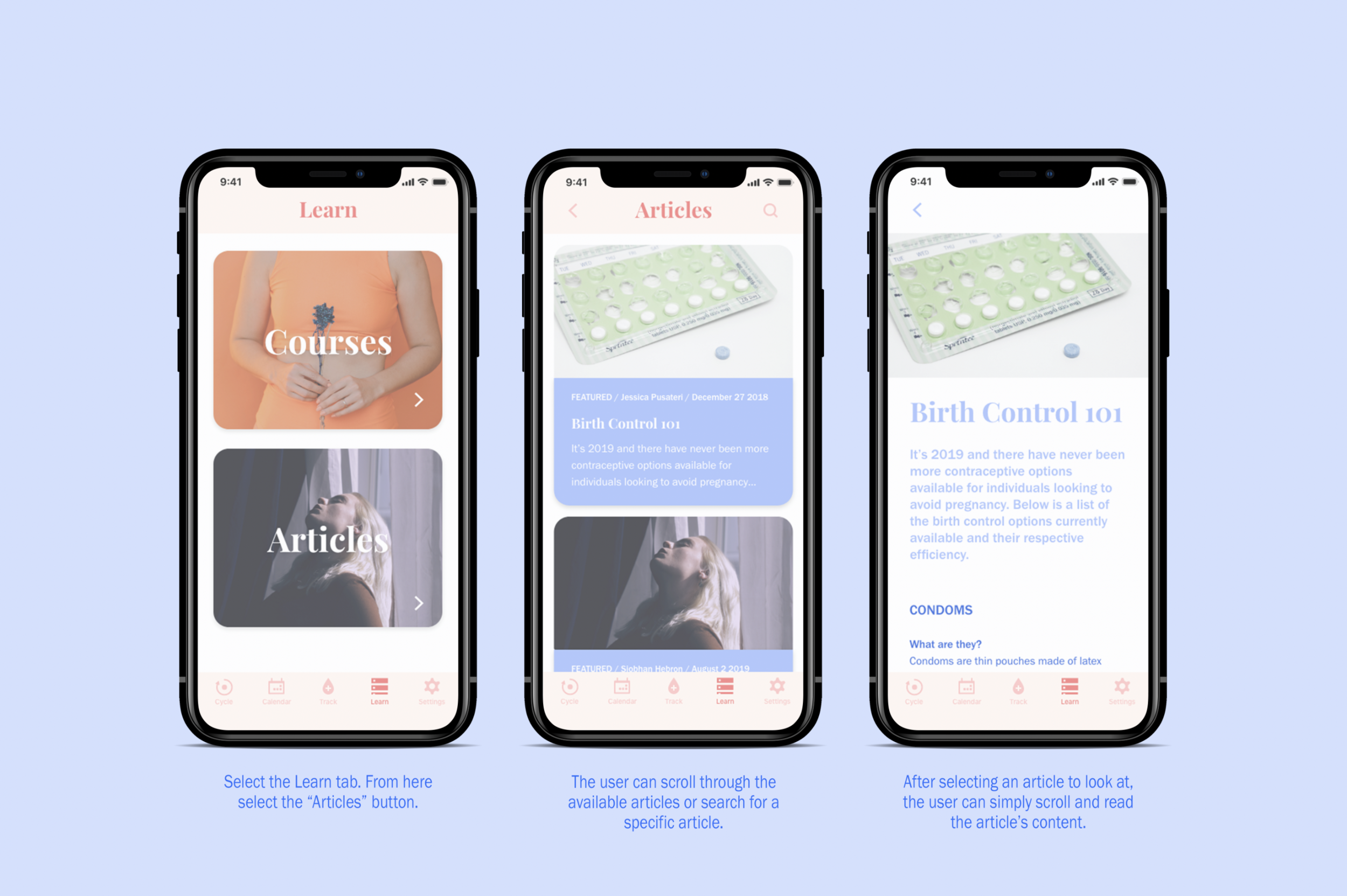
Educational Articles
Final Thoughts
Creating the concept for this app and then designing the original prototype was really enjoyable. Redesigning the Luna app was even more fun. It has really shown me how much I’ve developed as a designer. Overall, this is my favourite app design I’ve created.


